Blog
CEO roundup #1: how we develop our card acquiring and checkout form for max results
Hi, this is Tymur Valieiev, Sensus CEO. In my recent articles I've spoken about why we launched Sensus and the main reasons how our payment orchestration platform can give your business the uplift you need. But all this is big-time topics, which don't fully relate to our product development and my personal involvement in it.
So, as you can understand, checkout forms are much more than some fields on a page you fill to pay for your needs. On product scale we talk about last interaction between a customer and your business before money changes hands. Let's be honest: if this experience feels slow, confusing or untrustworthy, you – as a ready-to-buy customer – will abandon the cart and go on another app or website. It's bad and you don't have time to pretend it's not.
I'm not going to bore you with industry numbers. But the midscore from what I know confirms that checkout abandonment is one of the biggest leaks in online sales funnels, with global averages hovering around 70%. Yes, meaning seven out of ten carts never convert because the final payment step didn't engage the buyer effectively. This is clearly the basecamp for your effectiveness.
And that's where Sensus comes to save the day and your every financial report.
Checkout form design matters
It's basically make-or-break for conversions. It's where good design, customer trust, and payment tech all come together. Customers are highly sensitive to friction at this stage: even relatively minor delays, unnecessary fields or unclear instructions can increase abandonment.
And thus, this isn't a nice-to-have topic for any merchants or tenants/companies (depending on our use cases). It's the difference between traffic and actual revenue. A customer who reaches the checkout page has already invested time and intent. If the form design doesn't guide them smoothly to completion, that intention never turns into a transaction.
From the perspective of user psychology, the final step in checkout triggers the highest level of buyer anxiety. Customers are handing over personal and financial information. They need immediate reassurance. Usually it goes through clarity, speed and confidence indicators, making him/her sure that the process is secure and will complete without hiccups. That reassurance is a direct driver of conversion success.
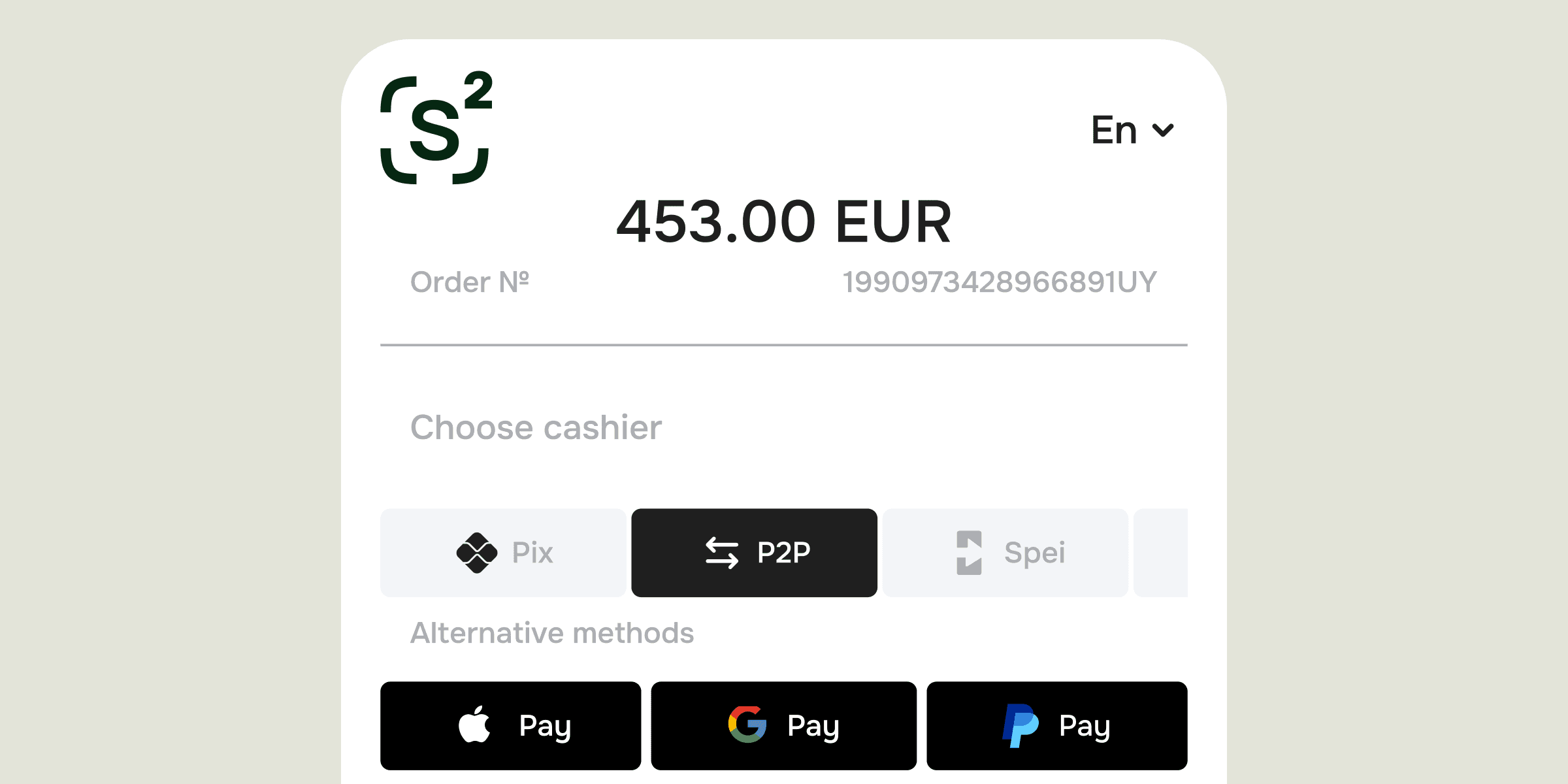
I personally invested a lot of time to make improvements to the checkout form on the different stages of our development. Our lead designer knows what he's doing and thanks to him we made really efficient basic form – with full adaptability to our design assets.
Visual checkout optimization: a Sensus touch
As you may already recall, I don't see checkout as just some template you drop in. For us, it's a core product feature that deserves real attention. Our goal is to create forms that are both efficient and adaptable to different markets, devices and user behaviour. The foundation of this approach comes directly from the Sensus brand idea: to build configurable tools that support merchants' goals with minimal friction – all over the world and whatever business scale you're operating in.
Firstly, we focus on clarity and minimalism. That means not only minimalistic functional design or avoiding any fields that distract or delay the customer. It's also about not taking unnecessary data and showing you the most detailed analytics based on existing info.
Secondly, we prioritise responsive and intuitive design. A checkout that performs well on desktop but is slow or cumbersome on mobile will lose large segments of today's buyers. With more than 70–80% of e-commerce traffic now coming from mobile devices globally, a mobile-first experience is essential for maximised conversion performance. Sensus' forms are optimised for all screen sizes and input patterns, making sure elements are easy to interact with and errors are clearly explained in real time.
Thirdly, we embrace adaptive payment experiences. Different customers expect different payment methods, and modern forms reflect that. Embedded digital wallets, local payment options and express buttons (like almost classical Apple Pay or Google Pay) reduce mental effort and get people through checkout faster. Removing the need for users to type long card details or create accounts removes common triggers for abandonment.
All these security badges and privacy notices you may blame as annoying – they're not just decoration, they actually calm people down when they're nervous about entering their card details. They are confidence boosters that reassure users at a critical moment. The form also supports dynamic error messaging that helps users correct issues without abandoning the process – another subtle yet impactful optimisation.
Sisyphean labour of making things better
While UX is crucial, it must be supported by strong technical implementation. Behind the scenes, Sensus' checkout form integrates seamlessly with our card acquiring stack, authorisation logic and routing systems. This integration means that once a customer submits a form, the payment process continues without interruption. The platform monitors authorisation outcomes and, if needed, triggers fallbacks or alternative paths — all without additional clicks from the customer.
From a performance standpoint, we focus on load times and latency. Even fractional delays can affect conversion behaviour. A responsive UI, lightweight asset loading and asynchronous handling of validation and payment submission all contribute to keeping interactions snappy.
And, of course, let's not forget about continuous testing and refinement. A checkout form is not static. Consumer preferences evolve, device patterns change, and fraud prevention measures update over time. A/B tests on layouts, field orders, button labels and express payment placement help identify which variations improve key metrics like completion rates and time-to-pay.
Final thoughts
If you want to grow your business, you can't treat checkout optimization as something you'll get to later. A well-designed and technically robust form reduces abandonment, increases revenue per visitor and reinforces a trustworthy brand experience. That's why Sensus invests deeply in crafting checkout experiences that combine clean design with payment tools that actually work.
People expect everything to be smooth these days – payments included. Your checkout form is where you either win or lose them. Get them right, and you transform intent into revenue consistently. Get them wrong, and you leave value on the table.
Book a Free Demo
and Make Sensus Happen
See how Sensus can power your business

Sensus © 2026.
All rights reserved