
Blog
Checkout is the last impression — here's why it's worth getting right
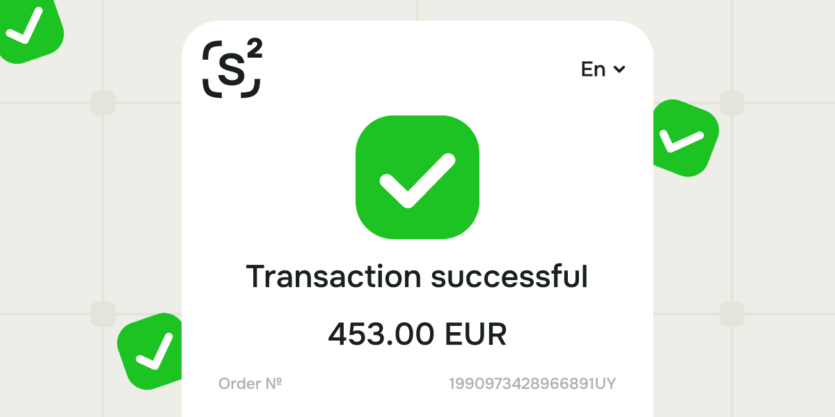
Hi, Sensus Tech team speaking here and here's a question for you: think about the last time a payment experience made you pause. A logo you didn't recognise. A redirect to an unfamiliar page. A form that looked slightly off from the rest of the website. Probably a small moment — but enough to make you think twice and feel some friction.
The trust gap at the last step
A customer who reaches checkout has already made the decision to buy. The product is right, the price is acceptable, the experience up to that point has held. What happens next either confirms that decision or quietly unravels it.
The problem for many businesses is that the payment step introduces something foreign. Makes an 'uncanny valley' effect. A third-party interface surfaces — different fonts, unfamiliar branding, a URL that does not match. Technically, the transaction proceeds. Psychologically, something shifts. The customer is no longer in your product. And this can mean they will be in someone else's.
According to Baymard Institute, credit card security concerns cause 25% of shoppers to abandon checkout. That figure sits alongside other friction points — unexpected costs, too many steps, forced account creation — but security doubt is the one most directly shaped by how the payment interface looks and feels. A branded, consistent checkout removes that doubt before it forms.
What white-label actually means at checkout
White-label is often discussed as a branding decision. In practice, it is an operational one.
When a checkout form, cashier interface and payment confirmation page all carry the operator's branding — colours, typography, domain — the customer never perceives a boundary between the product and the payment. The experience is continuous. Trust, built across the entire journey, holds through the final step.
This matters differently depending on the business model. For direct-to-consumer merchants, it reduces the hesitation that costs conversions. For platforms managing multiple merchants, it means each merchant's customers interact with a consistent, professional payment experience — not some generic third-party screen that undermines the merchant's own brand equity.
The distinction between a white-label checkout and a customisable one is also worth making. Customisation typically means adjusting colours and adding a logo within someone else's template. White-label means the interface is fully yours. Yes, built on the orchestration platform's infrastructure, but presented entirely as your product.
Checkout as part of the orchestration layer
Here's where the conversation shifts from branding to infrastructure.
A checkout form that looks right, but sits on top of a fragmented payment stack still exposes the customer to the consequences of that fragmentation. We're talking about slow responses, failed transactions, missing local payment methods. The branded surface doesn't fix what is underneath.
On Sensus Tech, the checkout and cashier interface aren't separate from the orchestration layer. They're placed and functioning within it. Routing logic, payment method coverage — 150+ methods across 200+ currencies — and cascading fallback all operate beneath the same branded interface the customer sees. When a transaction needs to reroute, it does so invisibly. The customer's experience does not change. The brand impression holds.
This integration is what separates a genuine white-label orchestration platform from a payment provider that offers cosmetic customisation. The checkout is not a skin over a third-party product. It's the front end of a connected system — and we can provide you with one.
The operational upside
Consistent checkout branding also reduces support overhead. When merchants operate within a familiar, branded interface, onboarding takes less time and generates fewer questions. Customers who recognise the checkout as part of the platform they trust raise fewer disputes. Support teams spend less time explaining what a payment screen is and whose it belongs to.
For businesses managing multiple merchants with Sensus Tech — or tenants managing multiple companies — this consistency across every payment touchpoint is part of what makes the platform feel like a product rather than an integration. Every level of the structure sees the same quality of experience, under their own brand.
First impressions open doors. Last impressions determine whether customers return.
Checkout is where revenue is confirmed or lost. It's also where brand trust is either reinforced or quietly eroded. Most businesses don't see the erosion happening because it shows up in abandonment data rather than complaints.
Getting checkout right is not a design project. It's an infrastructure decision. The businesses that understand this build payment experiences that feel native from the first page to the final confirmation. Sensus Tech is built to make that the default.