
Blog
Sensus Tech’s payment orchestration dashboard design: built for ops, not just devs
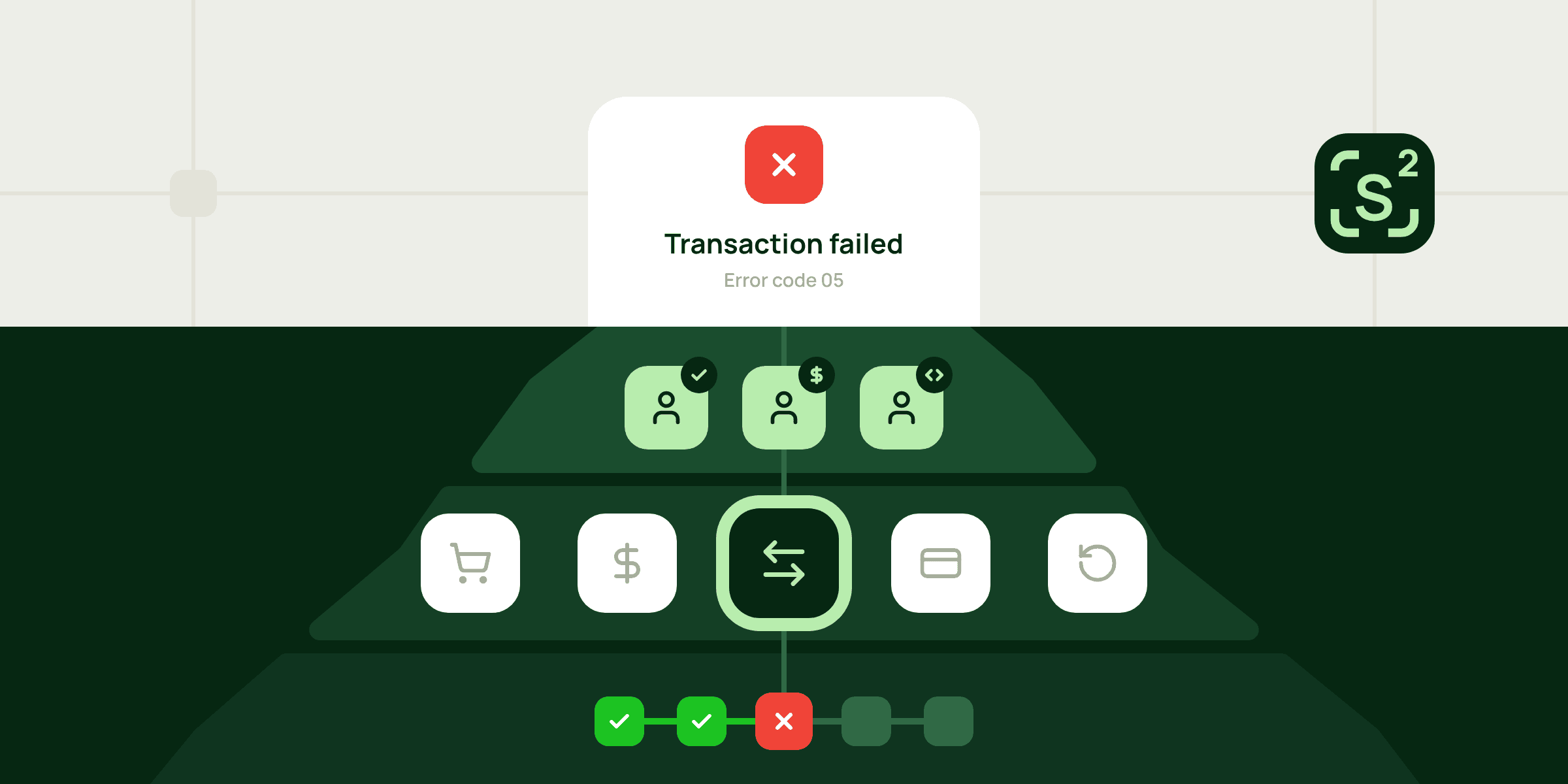
You go into the dashboard to check on a failed payment, and all you get is "failed" and some error code, nothing else. The customer's waiting for an answer, and you're stuck pinging the devs and waiting for one of them to free up, just to figure out what went wrong…
At Sensus Tech, we don't think it should work that way. If someone needs an engineer to understand what happened to their own payment, the problem isn't the person. It's the interface. And it's a common problem: too many payment dashboards are still designed by developers, for developers. But the people who use them every day are operations managers, finance teams and support.
So, when we built our back office, we set ourselves one goal: make complex payment logic understandable for everyone who works with it, from the payment dashboard to provider and routing settings. Our product designer Illia Abesadze took this on, and here's his account of where it started.
Designing a payment orchestration dashboard that makes sense
When I started working on the Sensus Tech dashboard, it looked like a classic interface task: tables, filters, forms, settings. The screens were only visible part: just the tip of the iceberg.
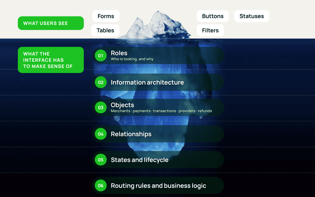
Below the surface of payment orchestration
Behind the screens was a system that connects merchants with multiple payment providers and handles payment flows, routing logic, transactions, refunds and day-to-day operations. Every new provider and every new use case added another layer.
So, the real question wasn't "How do I fit all this into a UI?" It was "How does this system actually work, and how do I make that clear to people who see it from completely different angles?"
That's why I didn't start with screens, and started with the system.
One transaction, different questions
Before thinking about screens, I looked at who would actually be working with the system.
It quickly became clear that a payment platform doesn't have one "user". Operations managers, finance specialists, technical specialists and administrators all work with the same data, but each of them comes to it with a different question.
An operations manager wants to know why a payment failed and whether it can be retried. A finance specialist looks at the same transaction and thinks about refunds or settlement. A technical specialist is more interested in what the provider returned or how the integration behaved.
That's when I started to see roles differently. A role isn't just about which buttons someone can press, or which pages they can open. It also shapes what a person needs to see, in what order, and which parts of the system matter to them at all. So, roles became one of the first foundations of product architecture.
Then I mapped out what each role was looking for, and a pattern emerged: they were all asking about the same things, just from different sides.
Information architecture: objects, not features
When I put all the roles questions side by side, it became clear they kept circling around the same few things: merchants, payments, transactions, providers, payment methods, routing rules, refunds and settlements.
The usual way to approach a dashboard is as a list of features: a payments table here, a refund button there, a provider page somewhere in the menu. But the product wasn't made of features, it was made of objects that each have their own life and are connected to one another.
Refunds show this best. It's easy to picture a refund as a button in the corner of a transaction screen, but a refund is an object of its own, tied to a specific transaction and payment. The same goes for providers. A provider isn't just a "providers" page in the menu. It's an entity that interacts with transactions, routing rules, payment methods, and configuration.
Once I looked at the platform that way, the information architecture just clicked. Navigation stopped being a list of screens I had to design and started showing how the product really works.
That was only half of the picture, though. The other half was how everything connects, so that's what I tackled next.
Mapping the roads between payments, providers and refunds
So I had the points on the map. Next came the roads between them, and it didn't take long to see that almost everything was connected to something else. Take a transaction. It never really lives on its own: it belongs to a payment, it's tied to a merchant, it uses a payment method and it goes through a provider. And if a refund comes along later, it links straight back to that same transaction.
Where this really hit home was when I got to the detailed views. I didn't want people clicking from one section to another just to piece together what happened. The connections had to be right there, in context. So, when someone opens a transaction, they should see more than just its current status: where it came from, which provider handled it, how it was routed and what happened after that.
That's what turned a bunch of separate screens into one connected system.
The transaction lifecycle: same payment, different moment
The same transaction can mean completely different things depending on the moment you look at it. That's why the next layer was understanding the lifecycle of each object, and for transactions it was particularly important.
A transaction doesn't move along a straight line. It has a main path, places where it can break, and what can happen to it later:
- Main path: Created → Processing → Authorized → Captured
- Can break: Failed, somewhere along the way
- Later: Refunded or Cancelled
These aren't just labels displayed next to a transaction. The state changes the meaning of the object and, most importantly, what the user can do with it. For example:
| State | What it means | What the user might do |
|---|---|---|
| Failed | Something went wrong along the way | May need to investigate the reason or retry |
| Captured | The money has been taken | A refund may become available |
| Refunded | The money has been returned | The same refund isn't offered again |
That turned into one of the rules I stuck to for the whole project: what a user can do with something depends on the state it's in. So, I stopped asking "What buttons go on this page?" and started asking "What state is this thing in right now, and what should the user be able to do next?"
Payment routing without a developer tool
Every payment in an orchestration platform goes through a decision before it reaches a provider: the system has to work out where to send it. That's what makes orchestration more complex than a regular payment flow. A transaction might be routed to a particular provider depending on the country, currency, payment method, amount or other business rules. Technically, that can quickly turn into a complicated set of conditions.
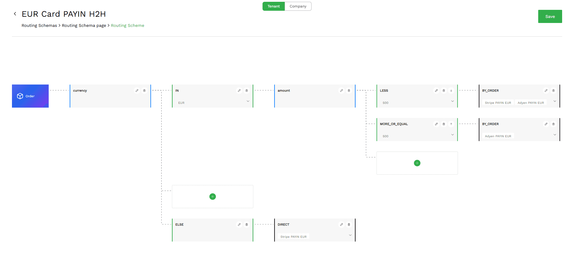
I didn't want to hide that logic, but I didn't want to throw all of it at people either. The goal was to show just enough for them to see what the system was doing, without the whole thing turning into a developer tool. And that's where roles, objects and states really paid off. A technical specialist might want to dig into the routing logic in full detail. An operations manager usually just needs to know which provider was picked and why a transaction failed. Underneath, it's the same system. The interface just meets each person at the level that makes sense for them.
Finally, the screens
Only after working through all these layers did I really turn to the screens, the part that at the very beginning had looked like the whole job. And by then, designing them was much easier, because tables, filters, transaction details, forms, provider settings and routing screens no longer had to be invented from scratch: their purpose was already defined by the model underneath.
The transaction table, for example, stopped being just a place to fit a large amount of data and became an operational tool that helps people understand what's happening across the whole payment system. The transaction details page, in turn, became a deeper look at the same object, with its relationships, history, status and the actions available right now.
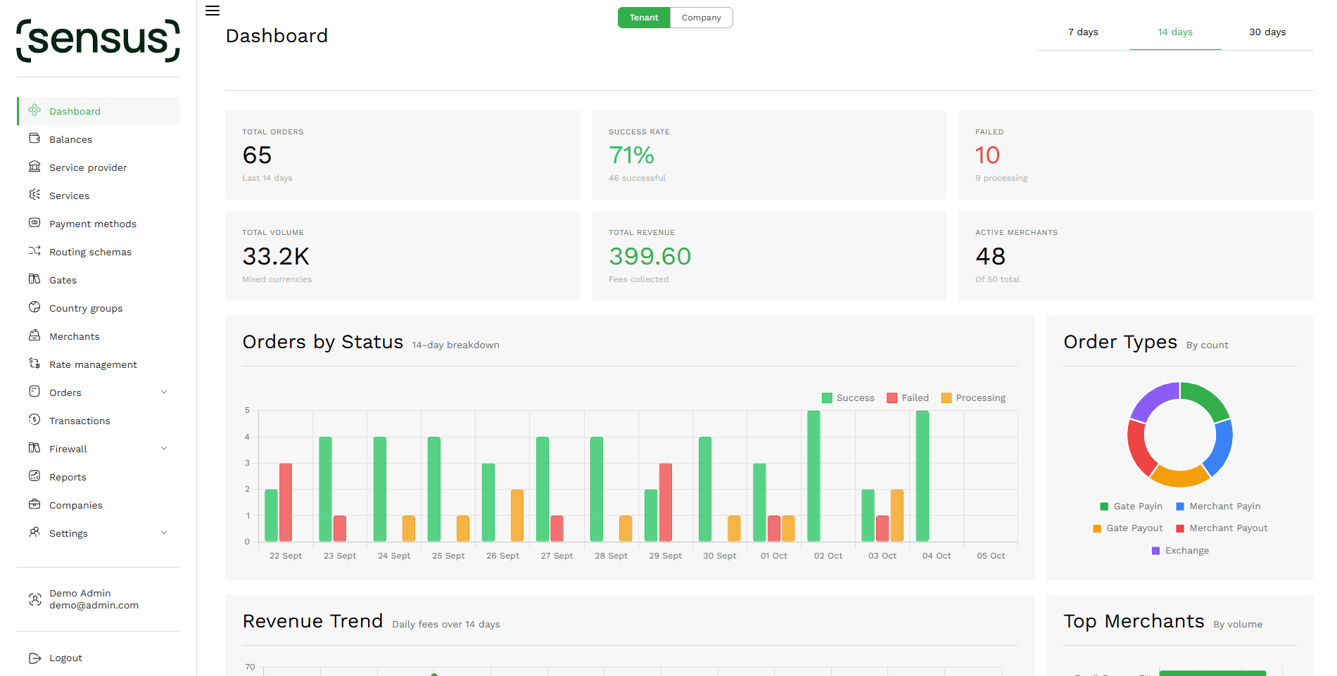
Step by step, the interface was turning into a visual representation of the product model itself.
What this project taught me about B2B fintech UX
The biggest lesson from this project turned out not to be entirely about interfaces. In complex B2B products, design is often less about individual screens and more about the system those screens represent. And the clearer that system is, the less users have to guess.
When the roles are clear, it becomes easier to understand what users need. When the information architecture is clear, it becomes easier to understand where things belong. When objects and their relationships are clear, it becomes easier to structure the experience. And when states are clearly defined, actions become much more predictable.
This project reinforced a principle that I now apply to complex product design in general:
Don't start by designing the screens. Start by understanding the system.
The interface is only the final layer, the visible part of everything that takes shape long before the first mockup. Behind it are the roles of the people who will work with the product, the architecture that gives everything its place, the objects and the relationships between them, the states those objects move through, and the rules that decide what can happen next. When those foundations are designed well, the interface doesn't have to hide the complexity of the product, because it can make that complexity understandable.
FAQ
What is payment orchestration?
Payment orchestration is a layer that connects a business to multiple payment providers, such as acquirers, banks and PSPs, and decides where each payment goes. Instead of integrating every provider separately, the business works through one API and one dashboard, while smart routing and cascading send each transaction where it's most likely to succeed. Sensus Tech is a payment orchestration platform built this way.
How does payment routing work in an orchestration platform?
Before a payment reaches a provider, the system decides where to send it. Routing rules can depend on currency, payment method, amount or limits, and smart routing with cascading sends each transaction where it's most likely to succeed. Technically, that quickly becomes a complex set of conditions. A technical specialist may need that logic in full detail, while an operations manager mainly needs to know which provider was selected and why a transaction failed.
Who uses a payment orchestration dashboard, and why do they need different views?
Operations managers, finance specialists, technical specialists and administrators all work with the same data, but each comes to it with a different question. An operations manager wants to know why a payment failed and whether it can be retried. A finance specialist thinks about refunds or settlements. A technical specialist looks at what the provider returned or how the integration behaved. So, a role should shape not only what a person can access, but what they see and what order.
At Sensus Tech, we believe an operations manager looking at a failed payment should immediately understand what happened and what to do next, without messaging developers or searching across different sections. That's the dashboard we set out to build.
See how failed payment investigation works on the Sensus Tech payment orchestration platform. Book a demo.
Illia Abesadze is a Product Designer at Sensus Tech, where he designs the payment orchestration back office used by operations, finance and technical teams. He has 7+ years of experience designing complex B2B and fintech products.